Best Companies World Class Accreditation logo

Using your Accreditation
Mark

Shout about your success. Adhering to our usage guide.

We encourage you to shout about your accreditation, as much as you can – remember, the sky is the limit! Get creative with using the logos.

But please remember to adhere to the following guidelines.

Using our mark.

Please use the following guide when using our Accreditation marks, if you have any queries please contact us directly...

  • There are two official versions of the Accreditation Mark that can be used... with outline for use on mid and darker colours and without outline for use on white and lighter colours
  • The Mark’s design and colour schemes should not be altered in any way, and should not be disassembled, cut or reproduced in its component parts. The Mark should not be rotated, skewed or distorted within a design (examples below)
  • The Mark should be distinguished from surrounding text and/or images, please use the appropriate version of the logo
  • In print the Marks minimum height is 15mm
  • Digitally the Marks minimum height is 60 pixels
  • Clear space should be observed around each Mark. There should be a minimum of 25% of the used height as clear space around the Mark on all sides. E.g. at the minimum print height of 15mm, there would be 3.75mm of clear space, at the minimum digital height of 60 pixels, there would be 15 pixels of clear space
  • The Marks have been designed to sit alongside each other as a suite, where you choose to do this all Marks should be the same height, and start with Accreditation on the left, then national list, region, and sector (where applicable)
  •  The Mark must be displayed at a size, subservient to an organisations main branding
  • If you have any queries, with regards to the usage of the Mark please contact us
Using our Mark animated gif

Correct use of our Accreditation Mark

Below are some examples of where and how Accreditation Marks should be used...

Accreditation logo used on white or light

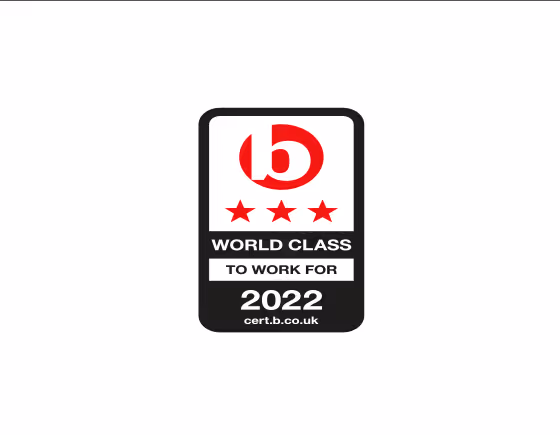
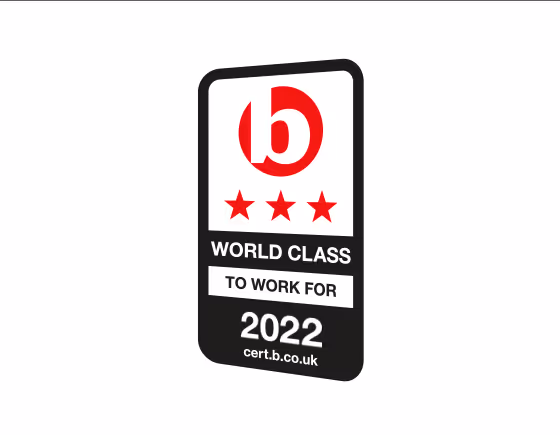
When using the Accreditation Mark on white and light colours, the version of the logo with no outline should be used

Accreditation logo used on grey and black

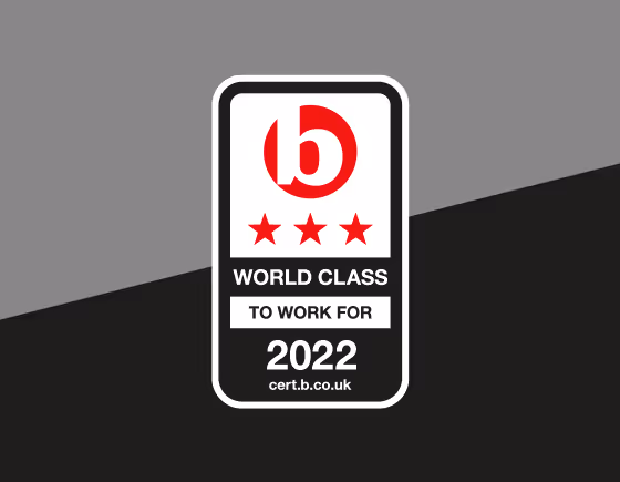
When using the Accreditation Mark on mid greys through to black, the version of the logo with outline should be used

Accreditation logo used on colour

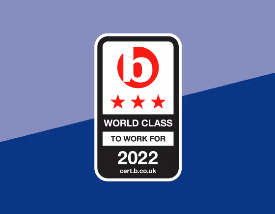
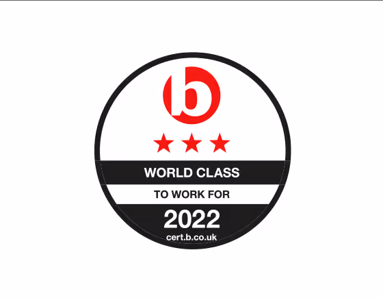
When using the Accreditation Mark on colours, the version of the logo with outline should be used

Accreditation logo used on image

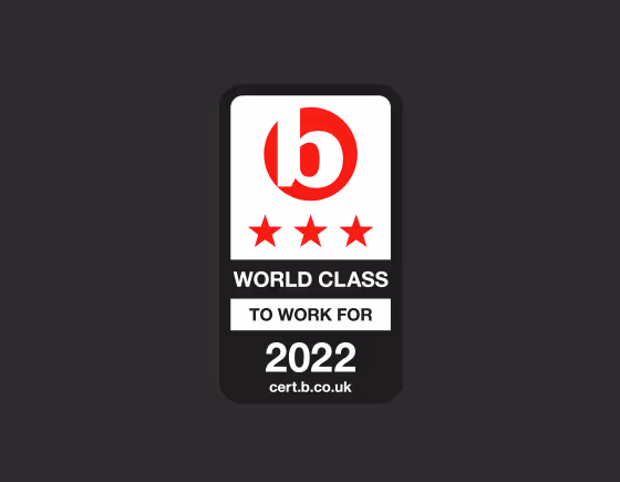
When using the Accreditation Mark on images, the version of the logo with outline should be used

Accreditation logo used one colour

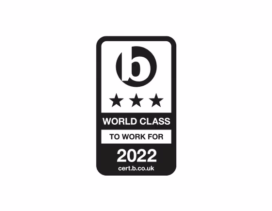
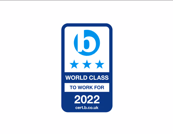
In some instances the one colour version of the logo can be used, please contact us if you need to use the logo in this way

Incorrect use of our Accreditation Mark - DO NOT'S!

Below are some examples of what you cannot do and how you should not use the Accreditation Marks...

Accreditation logo used on white or light

DO NOT stretch, squash or alter the proportions of the Accreditation Mark in any way

Accreditation logo used on grey and black

DO NOT skew, distort or rotate the Accreditation Mark in any way

Accreditation logo used on colour

DO NOT change the
colours of the Accreditation Mark to fit your branding

Accreditation logo used on image

DO NOT change the design or layout of the Accreditation Mark to fit your branding

Accreditation logo used one colour

DO NOT use the wrong version of the Accreditation Mark, please refer to usage above